19. Mutewatch logo
We open a new document with Inkscape.
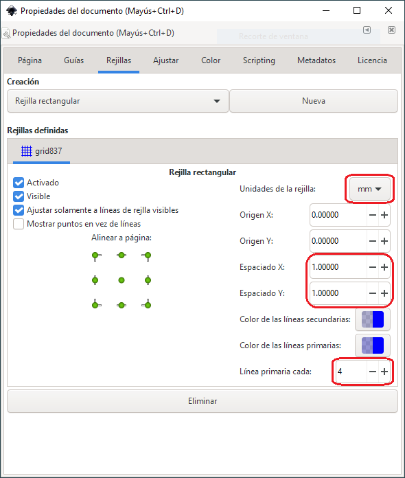
In the
File... Document Properties...menu under the Grids tab we add a new rectangular grid to the document and change the following parameters.Grid units in millimeters.
X spacing and Y spacing in 1 millimeter.
Primary line every 4.
Grid on, visible, and snap to visible grid lines only.
When we're done, close the window and we'll see a rectangular grid in the new Inkscape document.
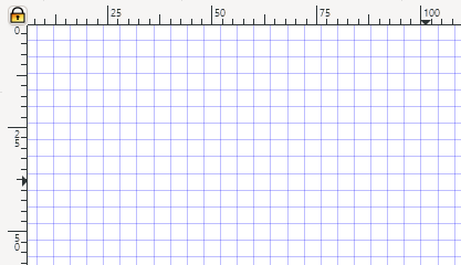
This grid will help us draw the points in place. Do not forget to activate the button on the right bar "Adjust nodes, paths and handles"
With the draw lines tool
 We draw the following lines on the screen.
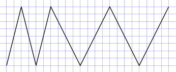
With the menu
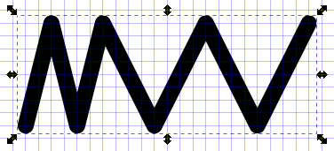
Object... Fill and Stroke...we change the thickness of the border to 5 millimeters and we round the joints and the tip of the stroke.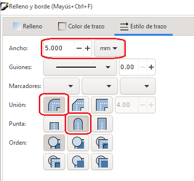
The trace will look like the following figure.
To continue, we need to convert the stroke to a path so it can be distorted later.
We apply the tool from the
Path... Stroke to pathmenu and with the node editing tool we can verify that the path has been converted into many waypoints.
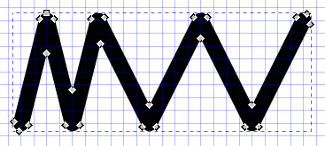
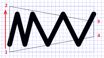
Now we are going to draw a trapezoid that will serve as a model to distort the perspective of the stroke. We must draw the points of the trapezoid in the order represented in the following image.
Select the two objects and apply the
Extensions... Modify Path... Perspective...menu tool and the path will be distorted as in the following image.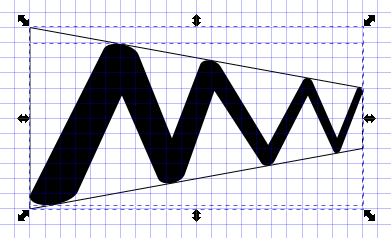
Finally, we remove the trapezoidal path.
We remove the display of the grid in the menu
File... Document Properties... Grids.We add the text "mutewatch" in normal Arial font of suitable size.
And we already have the finished logo.

Another way of thinking about making this logo is by drawing the strokes one by one, gradually changing their thickness as the strokes are further to the right. It is left as an open exercise to make the logo in this other way.